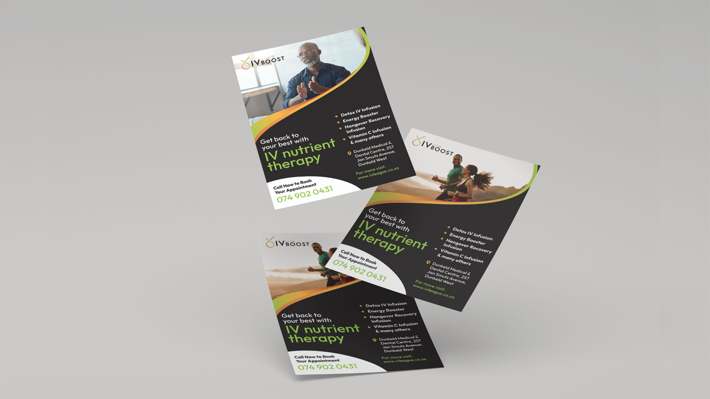
Precinct Group recognises the unique difficulties businesses and individuals face as they strive for improved physical and mental wellbeing. They introduced a new IV nutrient therapy product called IV League Therapy and sought our assistance in developing the logo and marketing materials for its launch.
The logo incorporates an outline of a drop with a strategically placed check mark above it. The drop symbolises IV therapy, while the check mark represents the positive results of the treatment: feeling rejuvenated and reenergised.
The addition of a fruit-like shape provides a lighthearted and welcoming element, enhancing the logo’s appeal to a broader audience. The use of green, orange and red colours serves to visually highlight the benefits of IV nutrient therapy, such as improved health and increased energy levels. The gradient further adds a dynamic and modern feel to the logo.